

Stadtreklame Nürnberg: A corporate design manual for a consistent brand identity
A corporate design alone does not guarantee a consistent brand identity. To make a brand recognizable at every touchpoint, you need clear design guidelines. Stadtreklame Nürnberg lacked this foundation for a future-ready brand identity. Different logo variations and color shades weakened the overall brand presence. At the same time, creating marketing assets took longer than necessary. Our solution is a corporate design manual that establishes clear design guidelines and simplifies every design decision.

When corporate design becomes an approval bottleneck
Stadtreklame Nürnberg had no binding guidelines for how to apply its brand identity. Since different people were responsible for presentations, posters, the website, and social media posts, the brand looked different across channels. Assets had to be reviewed and revised repeatedly, costing time and causing frustration within the team.
At the same time, the company was evolving. A corporate identity workshop had sharpened its positioning, while its product portfolio was becoming increasingly digital. The existing corporate design therefore needed to become not only more consistent but also future-proof and ready to support the brand's growth.
A design manual is only as good as its foundation
The original brief was to consolidate the results of the corporate identity workshop and the existing design guidelines into a manual. The logo and colors were meant to remain unchanged.
However, comparing the current brand identity with the outcomes of the CI workshop revealed that the existing design no longer reflected the desired brand identity of Stadtreklame Nürnberg.
So we took a step back and refined the logo, colors, and visual language before developing the manual.

Clear guidelines for a brand that grows with the business
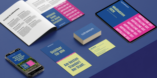
We adjusted the colors to reflect the new corporate identity, paying particular attention to accessibility in digital environments. We separated the tagline from the logo to create a cleaner, more balanced look and gave it a new role as a distinctive design element. In addition to defining clear design guidelines, diff provided a PowerPoint master template for presentations and Canva templates for creating social media content. This resulted in a flexible design system that goes beyond the corporate design manual by providing ready-to-use building blocks for implementation.


On-brand content at every touchpoint
The design system serves as a single source of truth for the team when making design decisions, enabling them to create on-brand assets more quickly. At the same time, it reduces errors, minimizes the need for coordination, and ensures a consistent brand identity across every touchpoint along the customer journey.
Anita Metter
Head of Marketing, Stadtreklame Nürnberg
“For us, the new corporate design is more than just a refresh. It represents a new level of maturity. First, it makes our day-to-day work easier: We have clear guidelines, can make decisions faster, and can implement many applications independently and consistently. The modular system reduces the need for coordination while giving us the freedom to create a wide variety of formats.
On the other hand, and perhaps even more importantly, our brand presence feels much more like us today. Clear and confident, and 'remarkably good' in everything we do, we show our customers that we don't just sell visibility – we embody it ourselves.“

Empower your team with a design system that enables consistent brand communication.
