Design Trends 2024: Bold & accessible?
How accessible are the Design Trends 2024? Our top 5 trends put to the test
Fashion, architecture, interiors, advertising, art, music, social media: trends are everywhere. Most of them go viral quickly these days and are considered cringe even faster. By contrast, developments such as AI-generated content, inclusion and accessibility are timeless. Even though we consider inclusivity and accessibility to be the cornerstones of good design and our work on a daily basis, the European Accessibility Act (EAA) currently makes the topic even more relevant. For this reason, we not only present our Top 5 Design Trends 2024 in this article, but also evaluate them regarding accessibility.
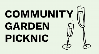
Large typography & doodle illustration
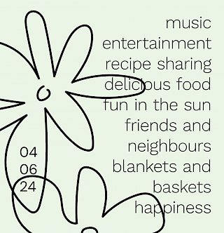
This trend should be fun: It combines oversized and bold typography with delicate, playful illustrations. The typography often takes center stage and is complemented by smaller, simple doodles. The message of the text is the focus and supported or loosened up by playful elements.
Our accessibility rating: 4/5
Large typography is often easier to read than small type (if you don't overdo it), so we don't see any problems here
However, if the Doodle illustrations overlap too much with the text, this can also lead to reading difficulties
A lot can go wrong with font choice. Good legibility is also important here
The contrast between typography and background must - as usual - be checked and high enough
For good accessibility, there must be no font on images or videos because e-readers and search engines cannot read them

Typo fusion & experimental typography
Back to 2000! The influence of the Y2K trend is unmistakable in this trend: oversized and bold typography meets 3D elements with special effects. Visually, this trend experiments with different materials such as glass, metal and plush.
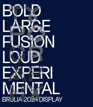
Our accessibility rating: 1/5
First and foremost, it is important that the typography is legible
Anyone experimenting with fonts should ensure good legibility and contrasts
The eye is not used to reading highly distorted fonts. The trend should only be used as a decorative element and should not contain any important information
For good accessibility, there should be no text on images or videos because e-readers and search engines cannot read them
Font graphics should also be avoided (with the exception of logos)

Pixel Art
Small, smaller, pixels! The smallest, digital image element forms the basic element in this design trend and is used playfully: Sometimes enlarged and made visible, sometimes nostalgic. Playful motifs reminiscent of earlier computer games are typical. Fun fact: We created our design with a non-pixel-based tool. :) <3
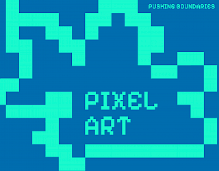

Our accessibility rating: 4/5
Pixel images are usually kept simple and therefore easy to describe in the alt text
Pixel typography should always be large enough and with high contrast to the background to ensure good readability

Bold minimalism & vivid color choices
Came to stay? That's the right question to ask when it comes to minimalism, as it has been riding the trend wave for a long time. By omitting filler elements, the focus is on the essentials. In 2024, the minimalist trend is being reinterpreted: minimalist designs in bright colors with high contrasts are now attracting attention.
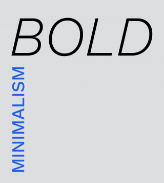
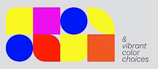
Our accessibility rating: 5/5
The simple designs of this trend are considered easy to grasp
When bright colors are used, contrasts are usually a given. Care must be taken here to ensure that two bright colors do not flicker together and form a poor contrast

Bento Grids
Bento grids reflect just how strong Apple's influence is on our design zeitgeist. Apple used this style to depict rather boring specifications in a visually appealing way. The design trend is now established and can be found everywhere on the web and in apps. Bento grids make it easier for the user to recognize visual hierarchies. Bento grids work particularly well with responsive and fluid web designs, which then move and scale along with the content depending on the page size.
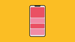
Our accessibility rating: 4/5
With a few rules, Bento Grids can be used very well for accessibility:
Attention should be paid to a coherent sequence for keyboard operability and for screen readers
The content of the individual cards must be made accessible in at least two ways
The cards have all the necessary states so that the user always knows exactly which card they are currently focused on or have selected

Conclusion
Design trends will be even more experimental, colorful and versatile this year. Things will be done differently than before; rules will be bent or even broken and the focus will be on playing with different tools, both analog and digital.
What is striking is that most trend forecasts are characterized by loud, strong colors, large typography and a desire to stand out. By contrast, pastel shades and understated designs will hardly be seen in 2024. Even minimalism has been given a colorful coat of paint after brands and designs in neutral tones were labeled "Sad Beige". The design world is visibly longing for a pop of color.
Trends are there to be played with. As long as they suit the brand and target group, they can be tried out, adapted and used without any problems. Nevertheless, accessibility must not be ignored so that everyone can participate in the trends.

